@media (max-width:600px){#bw-box{padding:20px 14px 14px !important}#bw-head{font-size:24px !important}#bw-r-val{font-size:36px !important}#bw-sum{font-size:15px !important}#bw-sum-val{font-size:20px !important}#bw-r,#bw-g{flex-basis:100% !important}}
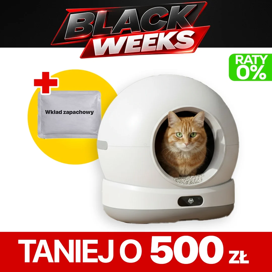
Black Weeks
Taniej o
500 zł
rabat Black Weeks
🎁 Dodatek gratis
Wkład anty-zapachowy
o wartości 10 zł · w zestawie
Łącznie zyskujesz 510 zł
Dodatek wysyłamy w jednej paczce z produktem.

Opinie naszych klientów
Sprawdź doświadczenia osób, które już korzystają z naszych urządzeń.
@import url(https://v1.fontapi.ir/css/SFProDisplay);
@font-face { font-family: NType82R; src: url(https://cobbo.pl/upload/cobbo/fonts/NType82-Regular.otf) format(„opentype”); font-weight: 400; font-style: normal; }
@font-face { font-family: NType82RMR; src: url(https://cobbo.pl/upload/cobbo/fonts/NType82Mono-Regular.otf) format(„opentype”); font-weight: 400; font-style: normal; }
@keyframes colorChange1 { 0%, 33% { color: #369CA7; } 100%, 34% { color: #343436; } } @keyframes colorChange2 { 0%, 33% { color: #343436; } 34%, 66% { color: #369CA7; } 100%, 67% { color: #343436; } } @keyframes colorChange3 { 0%, 66% { color: #343436; } 100%, 67% { color: #369CA7; } } @keyframes levitate { 0% { transform: translateY(0); } 50% { transform: translateY(-8px); } 100% { transform: translateY(0); } } /* Allow the tab-content to extend the full width of the page */
.product-card.mod-product-card-1 .tab-content { width: 100vw; /* 100% of the viewport width */ margin-left: calc(-50vw + 50%); /* This centers the full-width content */ padding: 20px; /* Add padding to ensure content is readable */ background-color: #fff; /* Optional: To distinguish the description section */ } /* Ensure the .tab-content spans 100% width without affecting product-info */ .product-card.mod-product-card-1 .tab-content .row { max-width: 100%; /* Override any width restrictions */ margin: 0 auto; /* Center the content */ } /* Keep the first col-md-12 (product info, buttons, etc.) intact */ .product-card.mod-product-card-1 .col-md-12:first-of-type { max-width: 1270px; /* Retain the current layout for the first section */ margin: 0 auto; /* Center it like before */ } div[data-tab=”product-safety-information”] { margin: 20px !important; /* Adjust as needed */ padding: 40px !important; /* Adjust as needed */ max-width: fit-content; } div[data-tab=”product-safety-information”] .tab-content { margin: 35px !important; /* Adjust as needed */ padding: 25px !important; max-width: fit-content; /* Adjust as needed */ } #pagination { display: flex; justify-content: center; /* Center the dots */ gap: 8px; margin-top: 10px; } #pagination div { width: 16px; height: 4px; border-radius: 5px; background-color: #e6e6e6; transition: background-color 0.3s ease; } #tytul-czarny-center { font-family: „SF Pro Display”, sans-serif; font-size: 60px; font-weight: 700; word-wrap: break-word; line-height: 1; text-align: center; margin-top: 50px; color: #000; } #tytul-czarny-left { font-family: „SF Pro Display”, sans-serif; font-size: 3.75em; font-weight: 700; word-wrap: break-word; line-height: 1; text-align: left; margin-top: 50px; color: #000; } .product-opinions { padding: 40px !important; /* Adjust as needed */ max-width: 1200px !important; margin: 0 auto !important; } #tytul-bialy-center { max-width: 90%; margin: 0 auto; padding: 10px; text-align: center; font-family: „SF Pro Display”, sans-serif; font-size: clamp(2.8rem, 8vw, 4rem); /* Increased min and max size */ font-weight: 700; color: #0C1618; line-height: 1.1; word-break: keep-all; overflow-wrap: normal; white-space: normal; text-wrap: balance; } #wistiavid-video-wrapper-square { position: relative; width: 100%; /* 100 % ⇒ perfect square */ } @media (max-width: 768px) { @keyframes slide { 0% { transform: translateX(0); } 100% { transform: translateX(-330%); } } #wistiavid-video-wrapper-square iframe { position: absolute; top: 0; left: 0; width: 100%; height: 100%; } #wistiavid-video-wrapper-square { width: 90vw; /* 90 % of the page */ max-width: 90vw; /* (caps inherited from min(viewport, 90 %)) */ margin: 0 auto 5px; /* centred + a little gap below */ } #intro-text1 { max-width: 90%; margin: 0 auto; /* Centers the text block if parent is wider */ font-family: „SF Pro Display”, „SF Pro Text”, „Helvetica Neue”, Arial, sans-serif; font-weight: 600; font-size: 24px; line-height: 28px; color: #6e6e6e; /* Approx. rgb(110, 110, 110) */ } #app-box-text-blocks { width: 100%; display: flex; flex-direction: column; align-items: center;} #app-box-left-block { width: 100%; margin-bottom: 20px; text-align: left;} #app-box-right-block { width: 100%; margin-bottom: 20px; text-align: left;} #app-box-text-blocks { width: 100%; max-width: 1200px; display: flex; align-items: flex-start; justify-content: space-between;} #tytul-bialy-left { font-family: „SF Pro Display”, sans-serif; font-size: 60px; font-weight: 700; word-wrap: break-word; line-height: 1; text-align: center; margin-top: 50px; color: #fff; } #description-text { margin-top: 10px; color: #343436; font-family: „SF Pro Display”, sans-serif; font-size: clamp(1.5rem, 3.5vw, 1.75rem); /* Scales ~16px–28px */ font-weight: 500; letter-spacing: 0.007em; line-height: 1.25; /* Slightly roomier for small screens */ text-align: center; /* Optional: Match title alignment */ } #sentence1 { animation: colorChange1 9s steps(1) infinite;} #sentence2 { animation: colorChange2 9s steps(1) infinite;} #sentence3 { animation: colorChange3 9s steps(1) infinite;} #app-box-left-block { width: 100%; color: #0C1618; font-family: „SF Pro Display”, sans-serif; font-size: 21px; font-weight: 600;} #app-box-right-block { width: 100%; color: #343436; font-family: „SF Pro Display”, sans-serif; font-weight: 600;} #app-box-left-block p, #app-box-right-block p { margin-top: 10px; padding: 0;} #app-box-left-block p { text-align: left;} #app-box-main-container { padding: 10px; display: flex; max-width: 1200px; flex-direction: column; align-items: center; } #app-box-right-block p { font-size: clamp(2rem, 6vw, 3rem); text-align: left;} #box-s2 { width: 100%; margin: 0 auto; padding: 20px; color: #fff; text-align: center;} #obrot-container { flex-direction: column; padding-block: 50px; } #obrot-video-container { line-height: 1; padding-top: 40px;} #obrot-features-container p { color: #343436; text-align: left; padding: 20px;} #obrot-video-container { margin-top: 5px; margin-bottom: 0px; max-width: 100%; /* Add margin for separation */} #obrot-title { font-size: 40px; /* Adjust font size for mobile */} #obrot-subtitle { font-size: 18px; /* Adjust font size for mobile */ margin-top: 20px;} #obrot-features-container { margin-top: 40px; /* Space above the container */} #obrot-feature-item1, #obrot-feature-item2, #obrot-feature-item3 { flex-direction: column; /* Arrange items in a column */ align-items: center; text-align: center; margin-top: 40px;/* Center text */} #obrot-feature-icon1, #obrot-feature-icon2, #obrot-feature-icon3 { margin-bottom: 5px; /* Space between icon and text */} #obrot-feature-text1, #obrot-feature-text2, #obrot-feature-text3 { color: #343436; font-family: „SF Pro Display”, sans-serif; font-size: 18px; text-align: center; font-weight: 400; /* Adjust font size for mobile */} #sentence1 { animation: colorChange1 9s steps(1) infinite; margin: 40px 0;} #sentence2 { animation: colorChange2 9s steps(1) infinite; margin: 40px 0;} #sentence3 { animation: colorChange3 9s steps(1) infinite; margin: 40px 0;} #tytul_white { margin-top: 40px; margin-left: 20px; text-align: center; font-family: „SF Pro Display”, sans-serif; font-size: 60px; font-weight: 700; word-wrap: break-word; line-height: 1;} #wholebox-bl { max-width: 100%; padding-top: 50px; background: #F7F5F2;} #wholebox-db { max-width: 100%; padding-block: 80px; background: #CEC7BC;} #wholebox-g { max-width: 100%; padding-block: 80px; background-color: #eeeeee;} #wholebox-dblue { max-width: 100%; padding-block: 80px; background-color: #0c1618;} #template-container { width: 95%; padding: 10px; margin: 0 auto; display: flex; flex-direction: column; gap: 10px; align-items: center; background-color: #F7F5F2; border-radius: 20px; } #template-container-mid { width: 95%; padding: 10px; margin: 0 auto; display: flex; flex-direction: column; gap: 10px; align-items: center; background-color: #F7F5F2; border-radius: 20px; } #template-image-container img { width: 100%; height: auto; object-fit: cover; margin: 0 auto; } #template-text-container { display: flex; flex: 1; flex-direction: column; justify-content: flex-start; } #template-black-title { max-width: 90%; text-align: left; font-family: „SF Pro Display”, sans-serif; font-size: clamp(2rem, 8vw, 4rem); /* Increased min and max size */ font-weight: 700; color: #000000; line-height: 1.1; word-break: keep-all; overflow-wrap: normal; white-space: normal; text-wrap: balance; order: 1; margin-bottom: 5px; } #template-white-subtitle-small { margin: 40px 0; color: #ffffff; font-family: „SF Pro Display”, sans-serif; font-size: 18px; font-weight: 300; letter-spacing: 0.011em; word-wrap: break-word; } #template-black-subtitle { color: #000000; font-family: „SF Pro Display”, sans-serif; font-size: 18px; font-weight: 400; word-wrap: break-word; padding-bottom: 20px; } #help-main-container { width: 100%; max-width: 95%; margin: 0 auto; padding: 20px; box-sizing: border-box; } #help-section { display: flex; flex-direction: column; align-items: center; width: 100%; background-color: #F5F5F7; box-sizing: border-box; padding: 20px; } #help-text-container { display: flex; flex-direction: column; align-items: center; text-align: center; margin-bottom: 20px; } #help-icon { width: 50px; margin-bottom: 10px; } #help-icon img { width: 100%; height: auto; } #help-title { font-size: 28px; font-weight: bold; color: #000; margin: 0; } #help-subtitle { font-size: 16px; color: #000; margin: 10px 0 0 0; line-height: 1.5; } #help-links { display: flex; flex-direction: column; align-items: center; margin-top: 10px; } #help-link1, #help-link2 { display: inline-block; font-size: 16px; color: #369CA7; text-decoration: none; margin: 5px 0; font-family: 'SF Pro Display’, sans-serif; } #help-link1:hover, #help-link2:hover { text-decoration: underline; } #help-icon1, #help-icon2, #help-mail-icon { margin-left: 5px; } #help-image-container { width: 100%; text-align: center; margin-top: 20px; } #help-image-container img { width: 90%; height: auto; } } @media (min-width: 768px) { @keyframes slide { 0% { transform: translateX(0); } 100% { transform: translateX(-330%); } } .product-informations { max-width: 100%; } #wistiavid-video-wrapper-square iframe { top: 0; left: 0; margin-left: 15px; } #app-box-main-container { padding: 20px; display: flex; flex-direction: column; align-items: center; } #app-box-left-block, #app-box-right-block { width: 50%; color: #0C1618; font-family: „SF Pro Display”, sans-serif; font-size: 21px; font-weight: 600; letter-spacing: 0.011em; line-height: 1.381002381;} #app-box-left-block p, #app-box-right-block p { margin: 0; padding: 0;} #app-box-left-block p { text-align: left;} #app-box-right-block p { font-size: clamp(2rem, 6vw, 3rem); text-align: right;} #app-box-text-blocks { width: 100%; max-width: 1200px; display: flex; align-items: flex-start; justify-content: space-between;} #description-text { margin-top: 10px; color: #343436; font-family: „SF Pro Display”, sans-serif; font-size: 28px; font-weight: 500; letter-spacing: 0.007em; line-height: 1.1428571429;} #hide-text { margin: 0; padding: 0 10%; color: #bdbdbd; font-family: „SF Pro Display”, sans-serif; font-size: 1vw; font-weight: 500; text-align: center;} #hide-text1 { margin: 0;} #sentence1 { animation: colorChange1 9s steps(1) infinite;} #sentence2 { animation: colorChange2 9s steps(1) infinite;} #sentence3 { animation: colorChange3 9s steps(1) infinite;} #box-s2 { max-width: 1300px; margin: 0 auto; color: #fff; font-family: „SF Pro Display”, sans-serif; text-align: center;} /* Parent container: Features (left) + Video (right) */ #obrot-container { display: flex; align-items: flex-end; justify-content: space-between; max-width: 1200px; /* or whatever width you prefer */ margin: 0 auto; padding-top: 20px; gap: 20px; /* space between left & right columns */ font-family: „SF Pro Display”, sans-serif; } /* Left column: Title above the features */ #obrot-left-column { display: flex; flex-direction: column; /* stack the heading above the features */ flex: 1; /* you can adjust relative sizing vs. the video */ } #obrot-text-container { flex: 1; width: 35%; /* Reduce the width to make the text take up less space */ padding-left: 10%; /* Add padding to create space between text and video */ color: #fff; } /* Left column: Features */ #obrot-features-container { flex: 1; /* or flex: 1.5 if you want the features bigger */ } #obrot-feature-item1, #obrot-feature-item2, #obrot-feature-item3 { display: flex; align-items: center; gap: 10px; /* Space between icon and text */} #obrot-feature-text1, #obrot-feature-text2, #obrot-feature-text3 { font-size: 20px; font-weight: 500; letter-spacing: 0.011em; line-height: 1.381002381; color: #343436;} #obrot-video-container { flex: 1 1 50%; max-width: 50%; min-width: 0; display: flex; /* turn it into flex container */ align-items: flex-end; /* stick content to the bottom */ } #obrot-video-container img { width: 100%; height: auto; max-width: 100%; display: block; } #obrot-youtube-video { position: relative; padding-bottom: 56.25%; height: 0; overflow: hidden; max-width: 100%; background: #000; margin: 0 auto; } #obrot-video-wrapper { position: relative; width: 100%; padding-top: 100%; } #obrot-video-wrapper iframe { position: absolute; top: 0; left: 0; width: 100%; height: 100%; } #obrot-youtube-video iframe { position: absolute; top: 0; left: 0; width: 100%; height: 100%; } .wistia_embed { width: 100%; height: 100%; position: relative;} .wistia_embed iframe, .wistia_embed object, .wistia_embed embed { width: 100%; height: 100%;} /* NOWY BOX */ #template-container { display: flex; justify-content: center; /* center all children horizontally */ align-items: flex-end; max-width: 1300px; margin-inline-start: auto; margin-inline-end: auto; padding-block: 15px; border-radius: 20px; padding-left: 10px; padding-right: 10px; background-color: #f7f5f2; } #template-container-mid { display: flex; justify-content: center; align-items: center; max-width: 1300px; margin-inline-start: auto; margin-inline-end: auto; padding-block: 15px; border-radius: 20px; padding-left: 10px; padding-right: 10px; background-color: #F7F5F2; } #template-image-container { margin: 0 auto; /* auto left/right margins center the container */ flex: 1; } #template-image-container img { width: 80%; height: auto; margin: 0 auto; object-fit: contain; } #template-text-container { max-width: 600px; display: flex; flex: 2; flex-direction: column; margin-left: 5px; justify-content: flex-start; } #template-white-title { margin: 0; line-height: 1; font-family: „SF Pro Display”, sans-serif; font-size: 60px; font-weight: 700; color: #fff; word-wrap: break-word; } #template-white-title-small { margin: 0; line-height: 1; font-family: „SF Pro Display”, sans-serif; font-size: 40px; font-weight: 700; color: #fff; word-wrap: break-word; } #template-black-title { margin: 0; line-height: 1; font-family: „SF Pro Display”, sans-serif; font-size: 64px; font-weight: 700; color: #000000; word-wrap: break-word; } #template-grey-subtitle { margin: 40px 0; color: #343436; font-family: „SF Pro Display”, sans-serif; font-size: 21px; font-weight: 600; letter-spacing: 0.011em; word-wrap: break-word; } #template-white-subtitle-small { margin: 40px 0; color: #ffffff; font-family: „SF Pro Display”, sans-serif; font-size: 18px; font-weight: 300; letter-spacing: 0.011em; word-wrap: break-word; } #template-black-subtitle { color: #000000; font-family: „SF Pro Display”, sans-serif; font-size: 21px; font-weight: 400; letter-spacing: 0.011em; word-wrap: break-word; } #tytul_white { background-color: #fff; color: #000; margin-top: 40px; font-family: „SF Pro Display”, sans-serif; font-size: 60px; font-weight: 700; text-align: center;} #wholebox-g { max-width: 100%; padding-block: 80px; background-color: #fafafa;} #wholebox-bl { max-width: 100%; padding-top: 50px; background: #F7F5F2;} #wholebox-db { max-width: 100%; padding-block: 80px; background: #CEC7BC;} #wholebox-dblue { max-width: 100%; padding-block: 80px; background-color: #0c1618;} #help-main-container { max-width: 1200px; margin: 0 auto; padding: 20px; gap: 20px; font-family: „SF Pro Display”, sans-serif; } #help-section { display: flex; width: 100%; align-items: center; /* Center text container */ background-color: #F5F5F7; box-sizing: border-box; justify-content: space-between; min-height: 450px; /* Adjust this as needed */ padding: 0 80px; } #help-text-container { flex: 1; display: flex; flex-direction: column; justify-content: center; /* Center text vertically */ padding-right: 50px; } #help-icon { width: 50px; margin-bottom: 10px; } #help-icon img { width: 100%; height: auto; } #help-title { font-size: 41px; font-weight: 600; color: rgb(29, 29, 31); margin: 0; } #help-subtitle { font-size: 21px; font-weight: 500; color: #000; margin: 10px 0 0 0; line-height: 1.2; } #help-image-container { flex: 1; display: flex; align-self: flex-end !important; /* Align image container to bottom */ justify-content: flex-end !important; height: 100%; max-width: 400px; box-sizing: border-box; } #help-image-container img { width: auto; height: 100%; object-fit: contain; display: block; } #obrot-features-container2 { display: flex; flex-direction: column; } #help-links { margin-top: 10px; } #help-link1, #help-link2 { display: inline-block; font-size: 16px; color: #369CA7; text-decoration: none; margin-right: 15px; font-family: 'SF Pro Display’, sans-serif; } #help-link1:hover, #help-link2:hover { text-decoration: underline; } #help-icon1, #help-icon2 { margin-left: 5px; } #tytul-bialy-left { font-family: „SF Pro Display”, sans-serif; font-size: 60px; font-weight: 700; word-wrap: break-word; line-height: 1; text-align: left; margin-top: 50px; color: #fff; } #intro-text1 { max-width: 1200px; margin: 0 auto; /* Centers the text block if parent is wider */ font-family: „SF Pro Display”, „SF Pro Text”, „Helvetica Neue”, Arial, sans-serif; font-weight: 600; font-size: 24px; line-height: 28px; color: #6e6e6e; /* Approx. rgb(110, 110, 110) */ } } /* Desktop styling: For screens 1200px and wider */ @media (min-width: 768px) { #wistiavid-image-container { width: 1200px; margin: 0 auto 10px auto; /* Centers container and adds bottom margin */ display: block; } } /* Mobile styling: For screens narrower than 1200px */ @media (max-width: 768px) { #wistiavid-image-container { max-width: 99%; /* never overflow parent */ width: 100%; /* scale down with parent */ height: auto; /* keep proportions, no stretching */ display: block; /* removes inline gaps */ } /* Maintain 16:9 aspect ratio */ #wistiavid-video-wrapper { position: relative; width: 100%; padding-top: 56.25%; } } /* Maintain 16:9 aspect ratio */ #wistiavid-video-wrapper { position: relative; width: 100%; padding-top: 56.25%; } #wistiavid-video-wrapper iframe { position: absolute; top: 0; left: 0; width: 100%; height: 100%; } @media (max-width: 768px) { #wistiavid-image-container2 { max-width: 99%; /* never overflow parent */ width: 100%; /* scale down with parent */ height: auto; /* keep proportions, no stretching */ display: block; /* removes inline gaps */ } #wistiavid-video-wrapper2 { max-width: 99%; /* never overflow parent */ width: 100%; /* scale down with parent */ height: auto; /* keep proportions, no stretching */ display: block; /* removes inline gaps */ } } /* Maintain 16:9 aspect ratio */ #wistiavid-video-wrapper2 { position: relative; width: 100%;} /* Desktop styling: For screens 700px and wider */ @media (min-width: 700px) { #wistiavid-image-container-szorowanie { width: 700px; margin: 0 auto 20px auto; /* Centers container and adds bottom margin */ display: block; } } /* Mobile styling: For screens narrower than 700px */ @media (max-width: 699px) { #wistiavid-image-container-szorowanie { width: 100%; margin: 0 auto 20px auto; /* Centers container and adds bottom margin */ display: block; } } /* Maintain 16:9 aspect ratio */ #wistiavid-video-wrapper-szorowanie { position: relative; width: 100%; padding-top: 56.25%; /* 16:9 aspect ratio */ } #wistiavid-video-wrapper-szorowanie iframe { position: absolute; top: 0; left: 0; width: 100%; height: 100%; } @media (max-width: 768px) { #template-black-title { order: 1; } #template-black-subtitle { order: 3; } }
#use-cases { max-width: 1200px; margin: 0 auto; } #use-row { display: flex; font-family: „SF Pro Display”, „SF Pro Text”, „Helvetica Neue”, Arial, sans-serif; font-size: 18px; flex-wrap: wrap; gap: 20px; justify-content: center; margin-bottom: 20px; } /* cells with fixed ratio */ #use-cell { flex: 1 1 30%; max-width: 30%; border-radius: 12px; overflow: hidden; aspect-ratio: 3 / 2; /* 600×400 */ display: flex; } /* images fill the box without stretching */ #use-img { width: 100%; height: 100%; object-fit: cover; /* crop to fit */ display: block; } /* description text cells */ #use-desc { flex: 1 1 30%; max-width: 30%; text-align: center; margin: 0; } /* Mobile: 2 columns */ @media (max-width: 768px) { #use-cell, #use-desc { flex: 1 1 75% !important; max-width: 75% !important; } }
Porównaj kuwety samoczyszące
COBBO K1 vs COBBO K2
| COBBO K1 | COBBO K2 |
|---|
| Specyfikacja techniczna |
|---|
| Wymiary kuwety | 53 x 50,8 x 58 cm | 53 x 51,6 x 58 cm |
| Średnica otworu wejściowego | 23,5 cm | 23,5 cm |
| Wysokość podstawy | 10,7 cm | 16,5 cm |
| Przedział wagi kota | 1 – 12 kg | 1 – 12 kg |
| Ekran sterujący | Sterowanie manualne | Sterowanie dotykowe, ekran |
| Funkcje i oprogramowanie |
|---|
| Ilość funkcji kuwety | 12 | 14 |
| Oczyszczanie światłem UV |  | |
| Funkcja sterylizacji | | |
| Wbudowana kamera z podglądem na żywo |  | |
| Wbudowany głośnik z mikrofonem | | |
| Aplikacja mobilna | | |
@media (max-width: 768px) {
#tabelap {
max-width: 100%;
}
}
@media (min-width: 768px) {
#tabelap {
max-width: 60%;
}
}
/* General table styling */
#custom-table {
width: 100%;
border-collapse: collapse;
font-family: „SF Pro Display”, sans-serif;
font-size: 16px;
border: 1px solid #e6e6e6;
margin: 20px 0;
}
#custom-table th {
background-color: #f9f9f9;
text-align: center;
padding: 12px;
border-bottom: 2px solid #e6e6e6;
font-weight: bold;
}
#custom-table td {
padding: 16px;
text-align: center;
border: 1px solid #e6e6e6;
}
/* Explicit row background colors for the alternating effect */
#custom-table tr:nth-child(even) {
background-color: #f9f9f9;
}
#custom-table tr:nth-child(odd) {
background-color: #ffffff;
}
/* Styling for feature column */
#feature-column {
text-align: left;
padding: 16px;
font-weight: bold;
}
/* Styling for checkmarks */
#custom-table td img {
width: 16px;
height: 16px;
}
/* Target the specific text-field within the Wysyłka w ciągu row */
.product-parameters tr:nth-child(2) td:nth-child(2) .text-field {
color: red; /* Adjust to your preferred color */
font-weight: bold;
}
Parametry techniczne:
- Moc znamionowa: 24 W
Zasilanie:
Minimalna waga kota: 1 kg
Maksymalna waga kota: 12 kg
- Wymiary urządzenia:
Wysokość: 53,0 cm
Szerokość: 51,5 cm
Głębokość: 58,0 cm
Wysokość podstawy: 16,5 cm
Średnica otworu wejściowego: 23,5 cm
Łączność: Połączenie z aplikacją mobilną (Smart Life, Tuya Smart)
Waga urządzenia: Ok. 7 kg
Zawartość zestawu
- Kuweta samoczyszcząca automatyczna
- Instrukcja obsługi
- Zasilacz
- Worek na odpady 15 szt.
- Wkład dezodoryzujący
- Mata zatrzymująca żwirek
Dedykowany opiekun klienta
Po zakupie otrzymasz kontakt do dedykowanego opiekuna, który wprowadzi Cię w pełen wachlarz zastosowań urządzenia, pokazując jak efektywnie korzystać z jego licznych funkcji.
Pomoc w obsłudze i doradztwo techniczne obowiązują przez cały okres użytkowania urządzenia.
Gwarancja COBBO™
Dwuletnia gwarancja prowadzona jest w systemie door-to-door, czyli od drzwi do drzwi. Sprzęt jest odbierany bezpośrednio w domu klienta, naprawiany i dostarczany ponownie do jego drzwi, w całości na koszt producenta.
Gwarancję podstawową można w dowolnym momencie jej trwania – nie tylko w chwili zakupu – przedłużyć nawet do 5 lat, co zapewnia długotrwałą ochronę i pełne poczucie bezpieczeństwa.

Najczęstsze pytania (FAQ)
Wszystko, co musisz wiedzieć o COBBO K2
Co się dzieje, jeśli kot wejdzie do kuwety podczas cyklu czyszczenia? 
COBBO K2 wyposażono w system automatycznego zatrzymania pracy. Urządzenie natychmiast przerywa cykl czyszczenia, gdy wykryje obecność kota w kuwecie lub jego zbliżenie się do wejścia, zapewniając pełne bezpieczeństwo zwierzęcia.
Czy mogę ręcznie wyczyścić kuwetę, jeśli chcę mieć pełną kontrolę?
Tak, możesz uruchomić funkcję ręcznego czyszczenia w dowolnym momencie, jeśli chcesz przejąć kontrolę nad procesem czyszczenia.
Czym różni się COBBO K2 od modelu K1? COBBO K2 to rozszerzona wersja kuwety K1. Oprócz wszystkich funkcji znanych z K1, model K2 oferuje wbudowaną kamerę i mikrofon, które umożliwiają podgląd wideo oraz odsłuch dźwięku w aplikacji mobilnej. Dodatkowo posiada bardziej rozbudowany panel sterowania i wyższą podstawę, poprawiającą ergonomię użytkowania.
Jakie żwirki są odpowiednie do kuwety COBBO K2?
Kuweta obsługuje żwirek mieszany, tofu, bentonitowy i mineralny, pod warunkiem, że długość ziaren nie przekracza 8 mm. Pamiętaj, aby używać odpowiedniego żwirku dla najlepszego działania urządzenia.
Czy oczyszczenie światłem UV jest bezpieczne dla kota?
Tak. Oczyszczenie światłem UV odbywa się wyłącznie wtedy, gdy kot nie korzysta z kuwety, a system bezpieczeństwa uniemożliwia jej uruchomienie w obecności zwierzęcia.
Czy kuweta COBBO K2 eliminuje nieprzyjemne zapachy?
Tak. Wkład odświeżający w kuwecie COBBO K2 odpowiada za neutralizację zapachów i utrzymanie świeżości w otoczeniu urządzenia. Działa w sposób ciągły, wspierając automatyczne czyszczenie oraz dezynfekcję światłem UV. Aplikacja mobilna informuje o konieczności wymiany wkładu, dzięki czemu zawsze masz pełną kontrolę nad komfortem i higieną.
Jaka jest gwarancja i czy można ją przedłużyć?
Standardowo 2 lata. Gwarancję podstawową możesz w dowolnym momencie jej trwania – nie tylko przy zakupie – przedłużyć nawet do 5 lat.
/* Import czcionki systemowej Apple */
@font-face {
font-family: 'SF Pro Display’;
src: local(’SF Pro Display’);
}
/* Stylizacja głównego kontenera tabeli */
#tabela-atutow {
max-width: 950px !important; /* Zapobiega rozciąganiu na całą szerokość */
margin: 40px auto !important; /* Centruje tabelę */
font-family: „SF Pro Display”, -apple-system, BlinkMacSystemFont, sans-serif !important;
border-collapse: collapse !important;
height: auto !important; /* Nadpisuje sztywne 1268px */
}
/* Reset stylów komórek */
#tabela-atutow td {
padding: 35px 20px !important;
height: auto !important;
border: none !important;
vertical-align: top !important;
}
/* NAGŁÓWKI – Bardziej widoczne i nowoczesne */
#tabela-atutow strong {
display: block !important;
font-size: 20px !important;
font-weight: 700 !important;
color: #1d1d1f !important; /* Głęboka czerń Apple */
margin-top: 15px !important;
margin-bottom: 10px !important;
letter-spacing: -0.01em !important;
line-height: 1.2 !important;
}
/* TEKST OPISU – Ograniczenie szerokości dla czytelności */
#tabela-atutow p {
font-size: 15px !important;
line-height: 1.6 !important;
color: #424245 !important;
max-width: 340px !important; /* Zapobiega rozciąganiu tekstu */
margin-left: auto !important;
margin-right: auto !important;
}
/* Usunięcie zbędnych odstępów pod obrazkami */
#tabela-atutow img {
height: auto !important;
max-height: 90px !important; /* Ujednolica wysokość ikon */
width: auto !important;
}
#two-cards {
display: flex;
gap: 20px;
justify-content: center;
max-width: 1300px;
margin-inline: auto; /* centers inside page */
padding-block: 0; /* no extra vertical padding */
}
#card {
flex: 1 1 50%;
background: #f5f5f5;
border-radius: 24px;
text-align: center;
position: relative; /* so the image can be positioned inside */
padding-top: 80px; /* space for the floating image */
}
#card-image {
width: 120px;
height: 120px;
overflow: hidden;
position: absolute;
top: -60px; /* move image higher above the card */
left: 50%;
transform: translateX(-50%);
display: flex;
align-items: center;
justify-content: center;
}
#card-image img {
width: auto;
height: 100%;
}
#card-text {
text-align: left;
padding: 20px;
font-family: „SF Pro Display”, sans-serif;
font-size: 18px;
font-weight: 400;
padding-bottom: 40px;
}
@media (max-width: 768px) {
#two-cards {
flex-direction: column;
}
#card {
max-width: 100%;
}
}